設計健康:融入自然、扣連生活的「健康」空間|Designing for health: Creating "healthy" spaces that tie in nature and connect with life

在上一篇,吉人吉事嘗試以空間角度出發,回顧「健康」一詞的演變,透過檢視我城醫療、社福等設施的發展,探討「健康」的定義如何影響城市規劃、設計和空間佈局。隨著「全人健康」概念漸趨普及,不少設計師均嘗試從環境因素入手,塑造更人性化的空間體驗,藉此促進身心健康。就讓我們看看不同案例,了解「健康」概念如何應用在空間設計。
荷蘭長者村:失智亦可如常生活
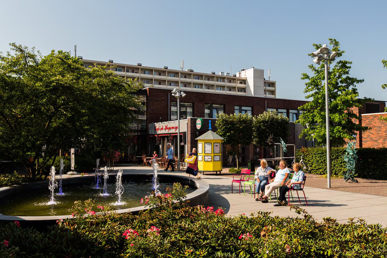
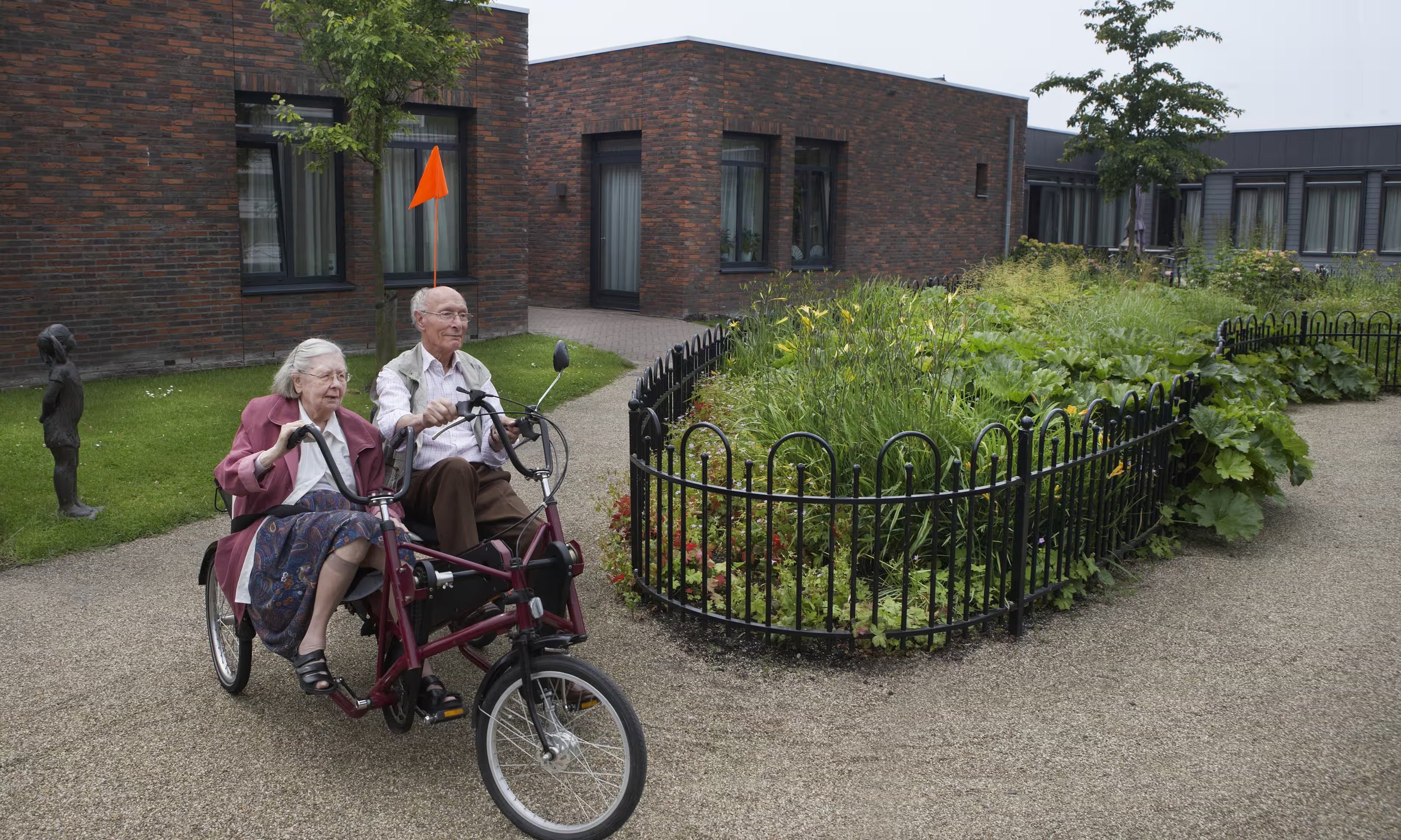
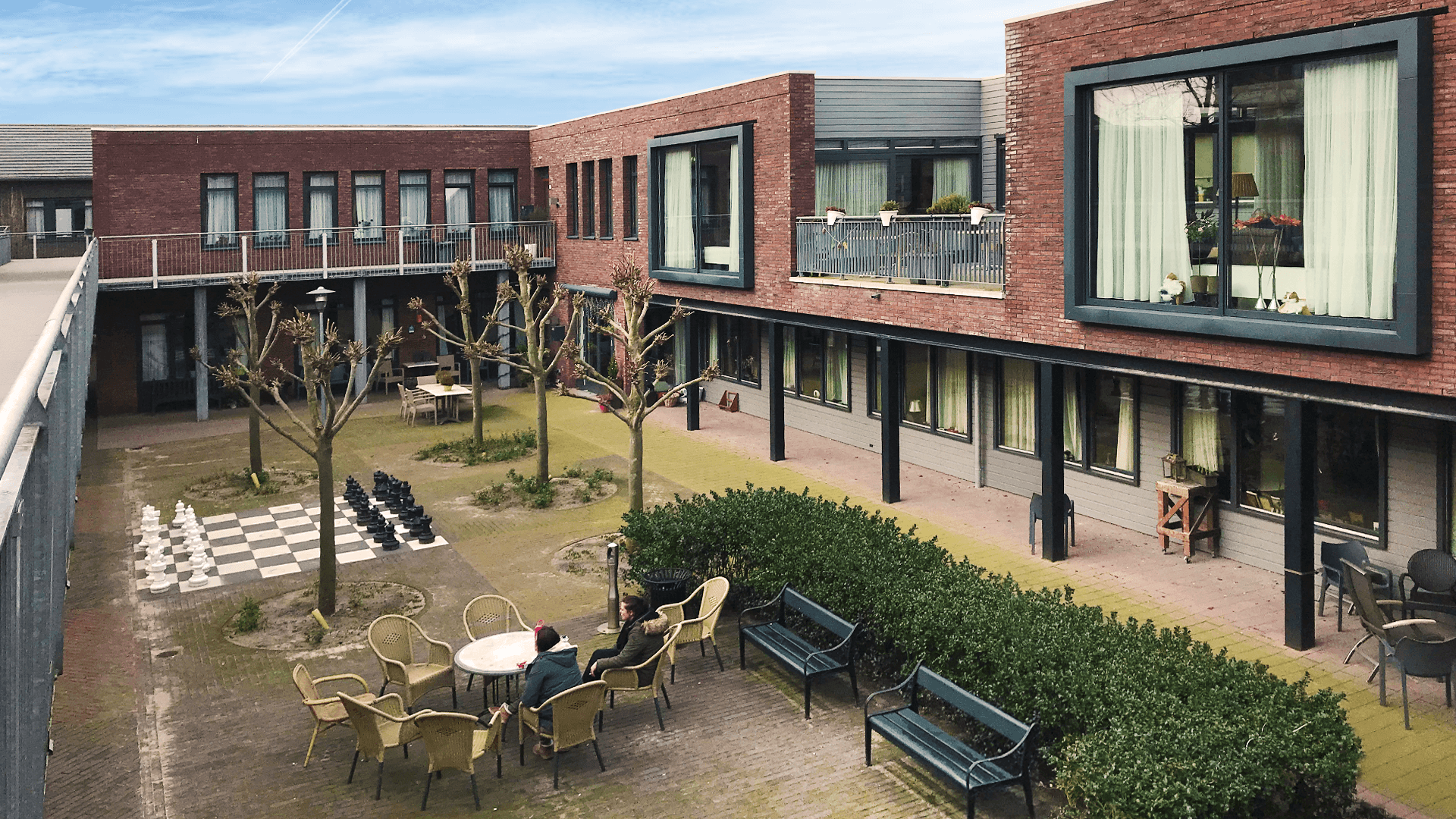
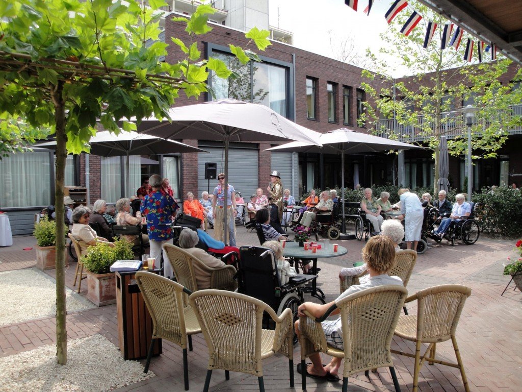
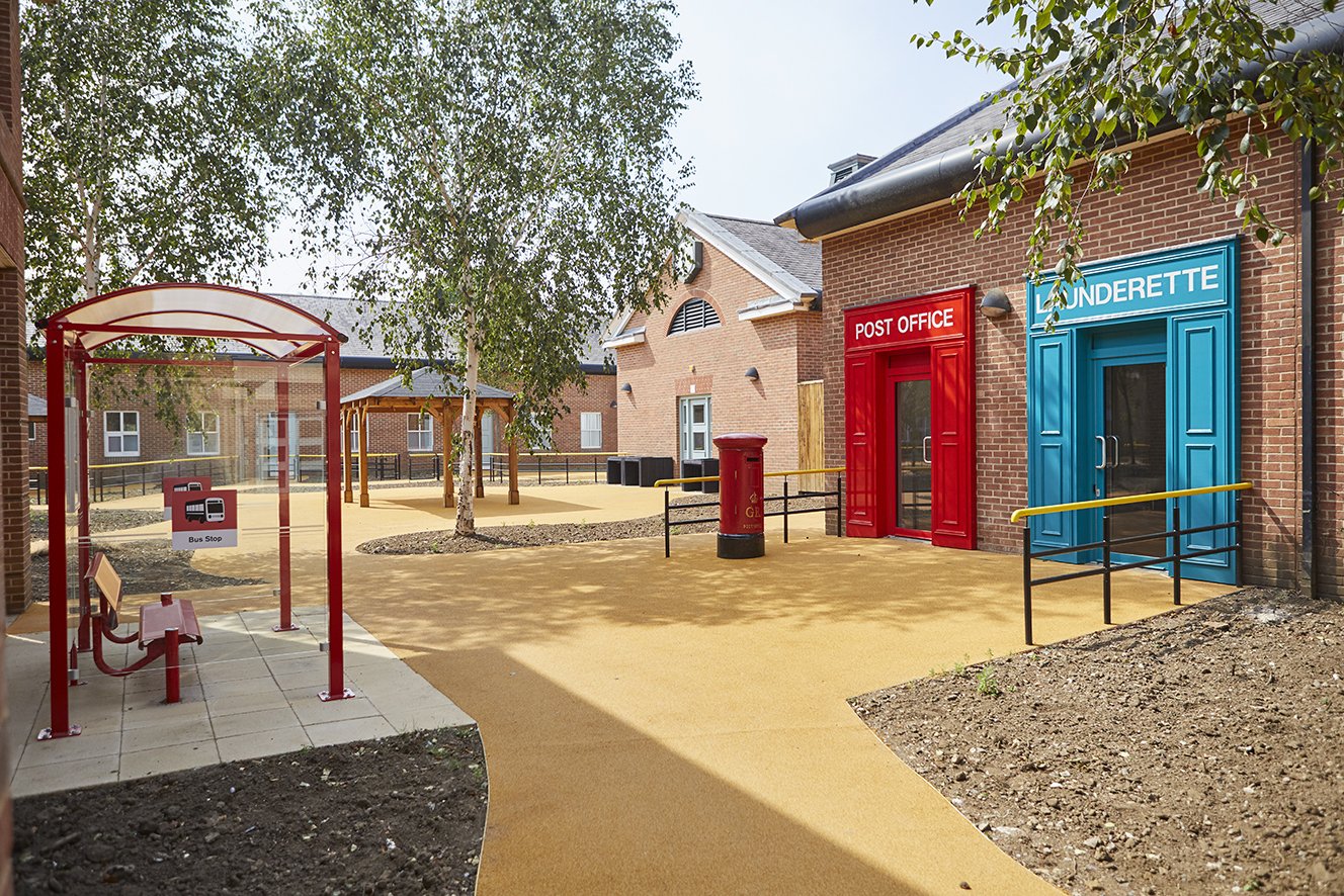
位於荷蘭霍格韋克 (Hogeweyk) 小鎮的 The Hogeweyk 是全球第一個「失智村」(Dementia Village),而「村民」們均是患有嚴重失智症的長者。The Hogeweyk 將自身定位為一個可以讓失智長者如常生活的地方(living as usual for people with severe dementia),希望透過改變空間佈局和營運模式,為長者營造出安心又自在的環境,並在最大程度上保留他們的自主性和生活質素。
取名為「村」,不止是爲了擺脫護理安老院的一貫形象:一式一樣的「病人服」、限制活動的約束衣、擠逼且冰冷的房間,亦反映了它如同小鎮般的規模。The Hogeweyk 主要由23間雙層獨立屋所組成,亦有由護理人員所「營運」的商店和餐廳,以及廣場等公共空間。「居民」均可獨自「出門」,自由穿梭於不同空間,自在地和其他「街坊」互動。這看似日常不過的光景背後,其實埋藏了不少心思。例如,在空間佈局上,針對失智長者容易迷路的走失的問題,鎮上各項設施均以一條大街貫穿,亦沒有後巷或死胡同,大大減低長者迷路及走失的風險。此外,由於失智長者大多不善於適應改變,團隊特意以上世紀50至70年代的建築風格建造出整條村,希望透過似曾相識的環境,協助他們適應新環境。
雖然「失智村」模式對於緩減腦退化的成效仍有待更多研究證實,但單以 The Hogeweyk 爲例,與早期以傳統安老院模式經營時相比,在2009年由傳統安老院轉營為「失智村」後,需要服用精神科藥物改善情緒及行為表現的長者人數大幅下降,可見這種模式確有一定成效,亦證明了環境因素在改善失智長者生活質素和健康狀況的重要角色。
丹麥赫爾辛格:與自然融爲一體的米字形精神病院
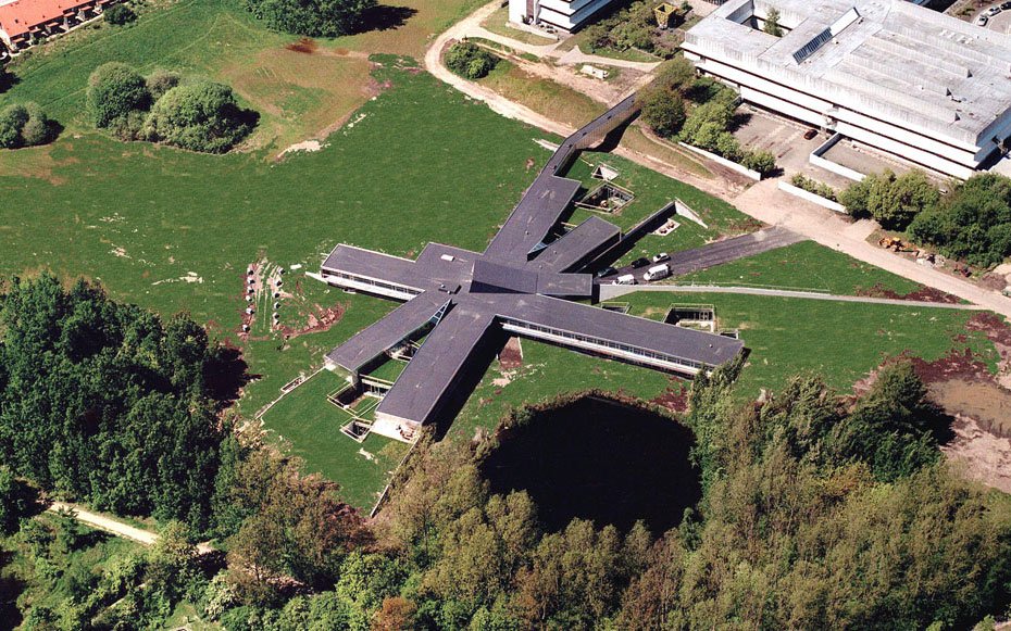
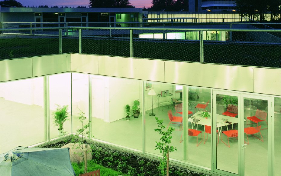
這座樓高兩層、白色米字型的精神病院位於丹麥東部沿海城市赫爾辛格 (Helsingør),由兩所著名建築事務所 Bjarke Ingels Group (BIG) 和 JDS Architecture 在 2006 年合作建成。病院特別的外觀源於項目團隊的初期用家研究。當時,團隊希望透過深入了解醫護人員、住院及門診病人,以及病人家屬的使用習慣和需要,藉此歸納出他們對於新病院的期望,並以此為空間規劃 (spatial programming) 的根據。雖然團隊最終無法從用家研究中得出新病院的「應有模樣」,卻發現了四組影響使用體驗,但又互相抵觸的空間特質:
既開揚又低調的空間 (open and closed)
步行距離短,但又不稠密的佈局 (centralised and decentralised)
既可以保留病人自主性,又能夠保障醫護人員掌控權 (freedom and control)
同時滿足病人私隱和社交需要 (privacy and sociability)
團隊深知若要滿足用家的需要,便要巧妙地在這四組空間特質取得平衡,亦絕不能參照傳統的醫院設計。於是,團隊先羅列出新病院所需的幾類空間:
供病人使用公用空間
留院病人的獨立房間
診療室、辦公室及其他設施
綠色空間
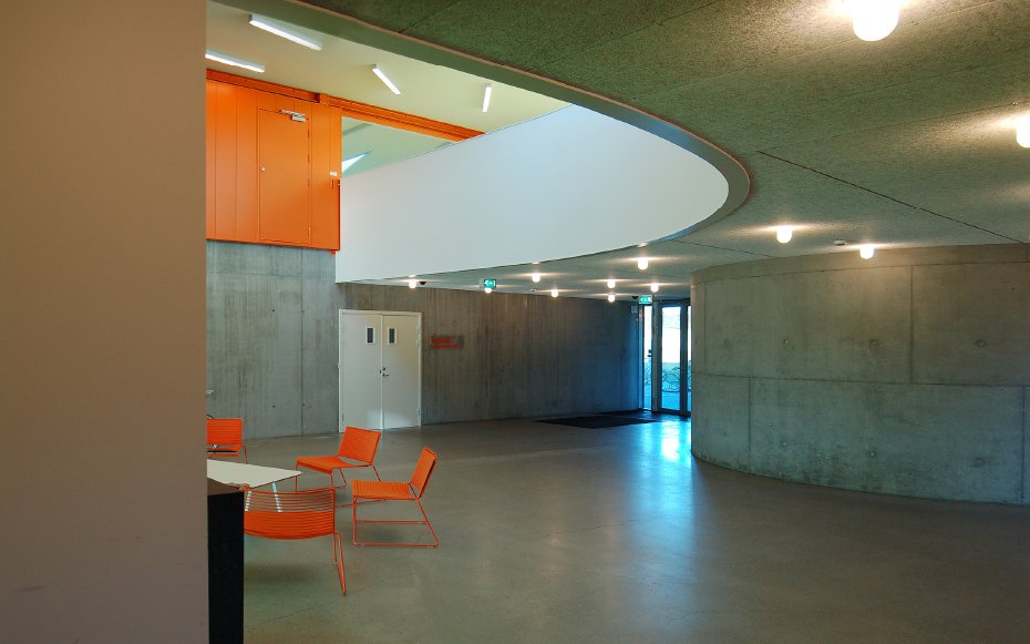
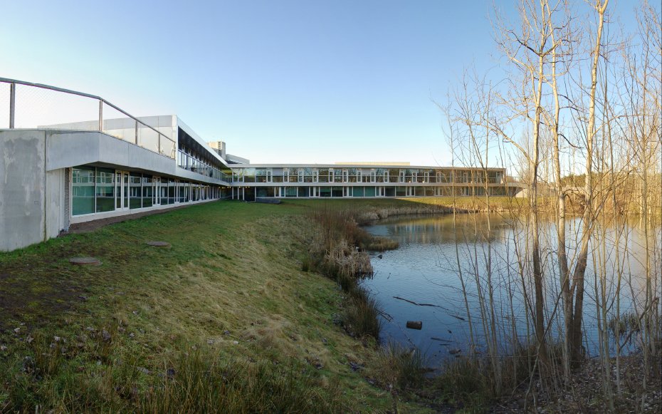
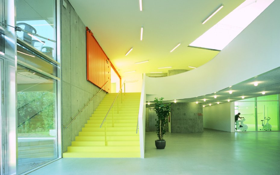
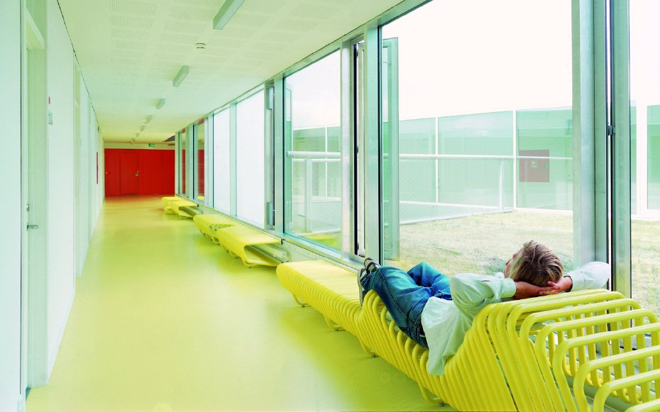
然後,就這四類空間,團隊再找出既能夠平衡以上四組空間特質,又可以充分善用周邊自然風光的空間佈局。經過多輪試驗後,決定用「米」字形組合不同空間:以「米」字的中心為病院的樞紐,然後往外延伸,將獨立病房分佈於四條走廊面向山和湖的兩側,中間再以公用空間和綠色空間作分隔。爲了加强療癒效果,團隊特意使用木材等自然物料,並將病院的第一層建於地下,利用落地玻璃及天窗,使其融入四周的小山丘,令身處病院不同角落的人均可接近自然。
屯門:家一樣的癌症關顧中心
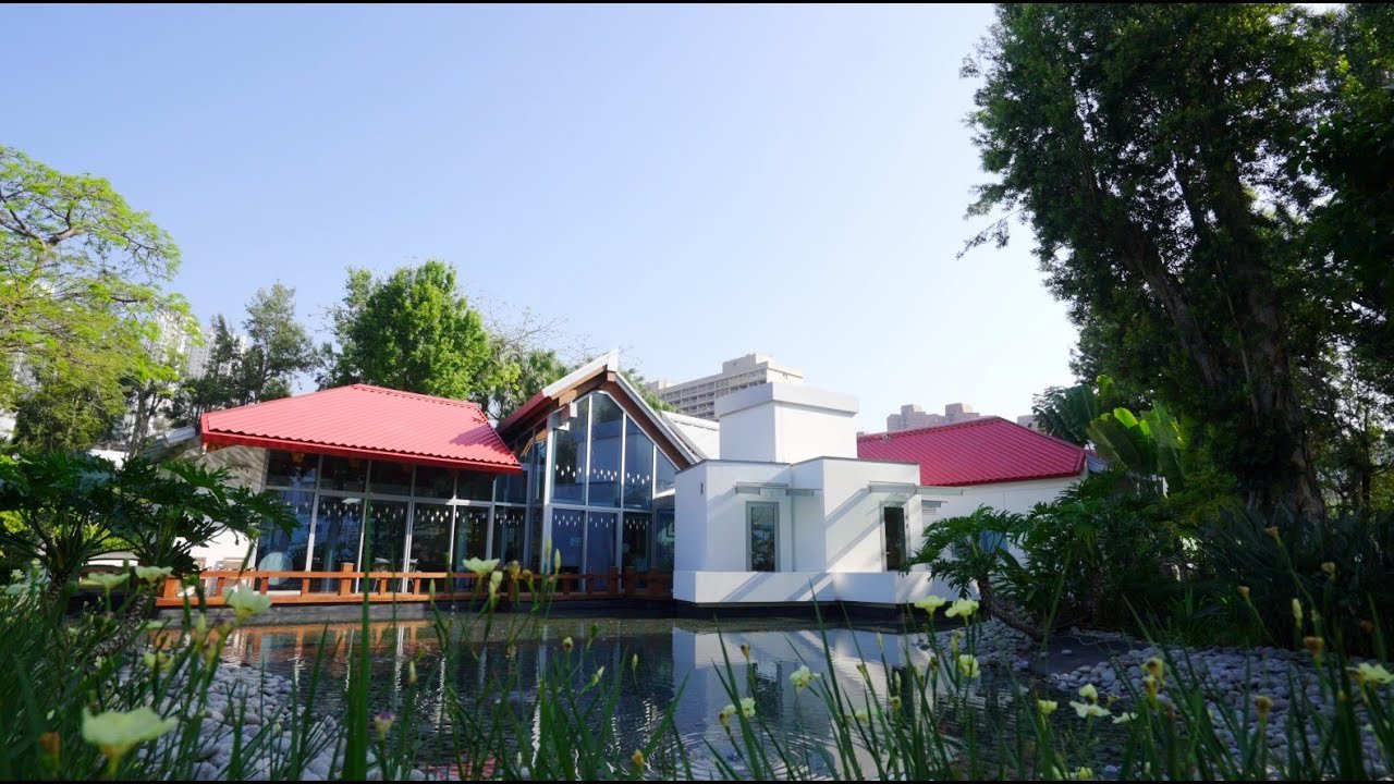
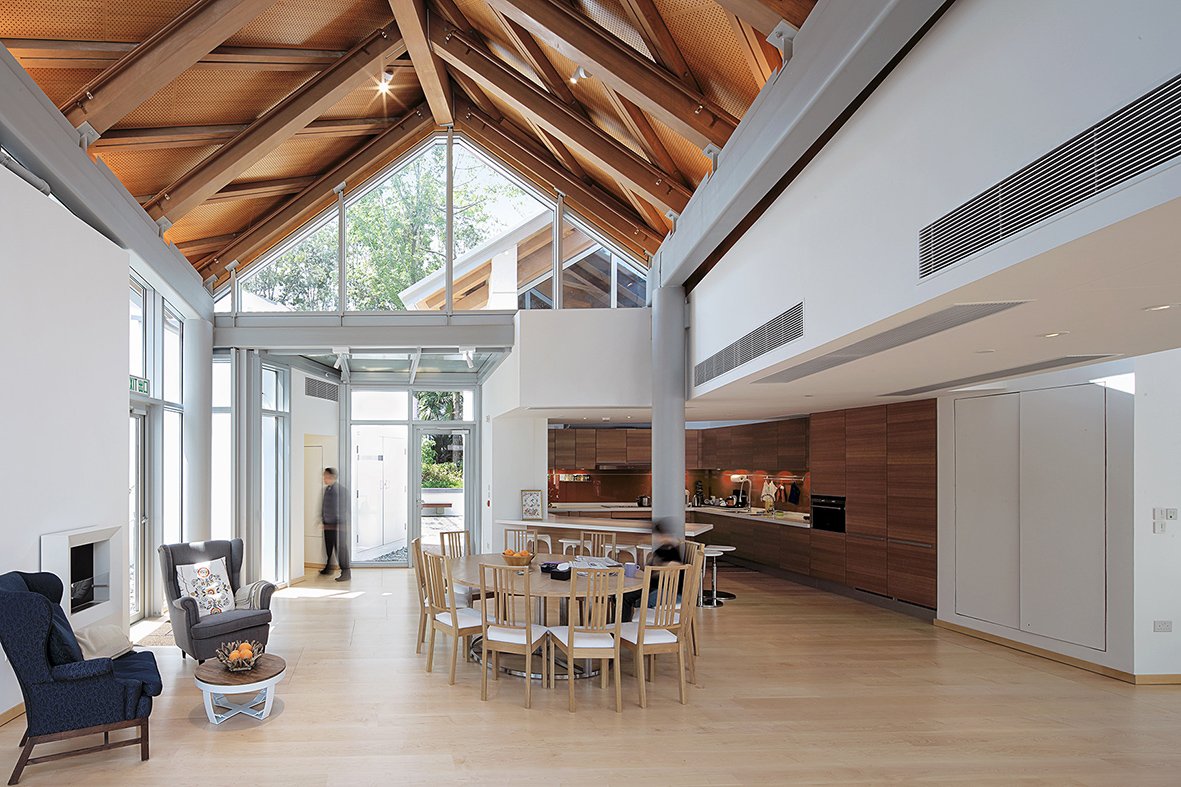
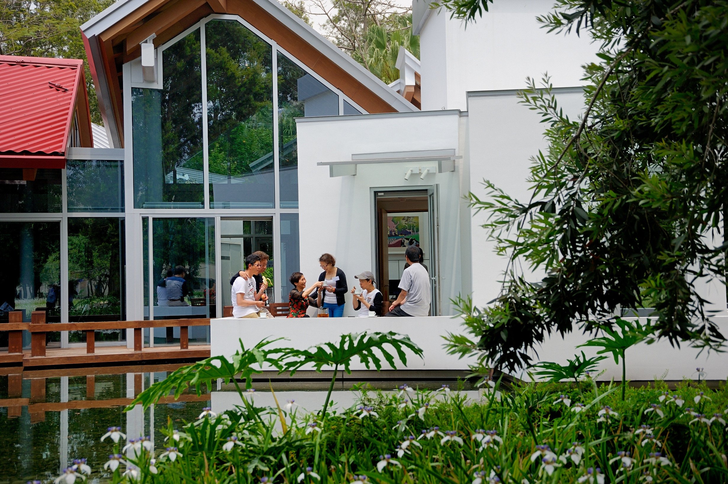
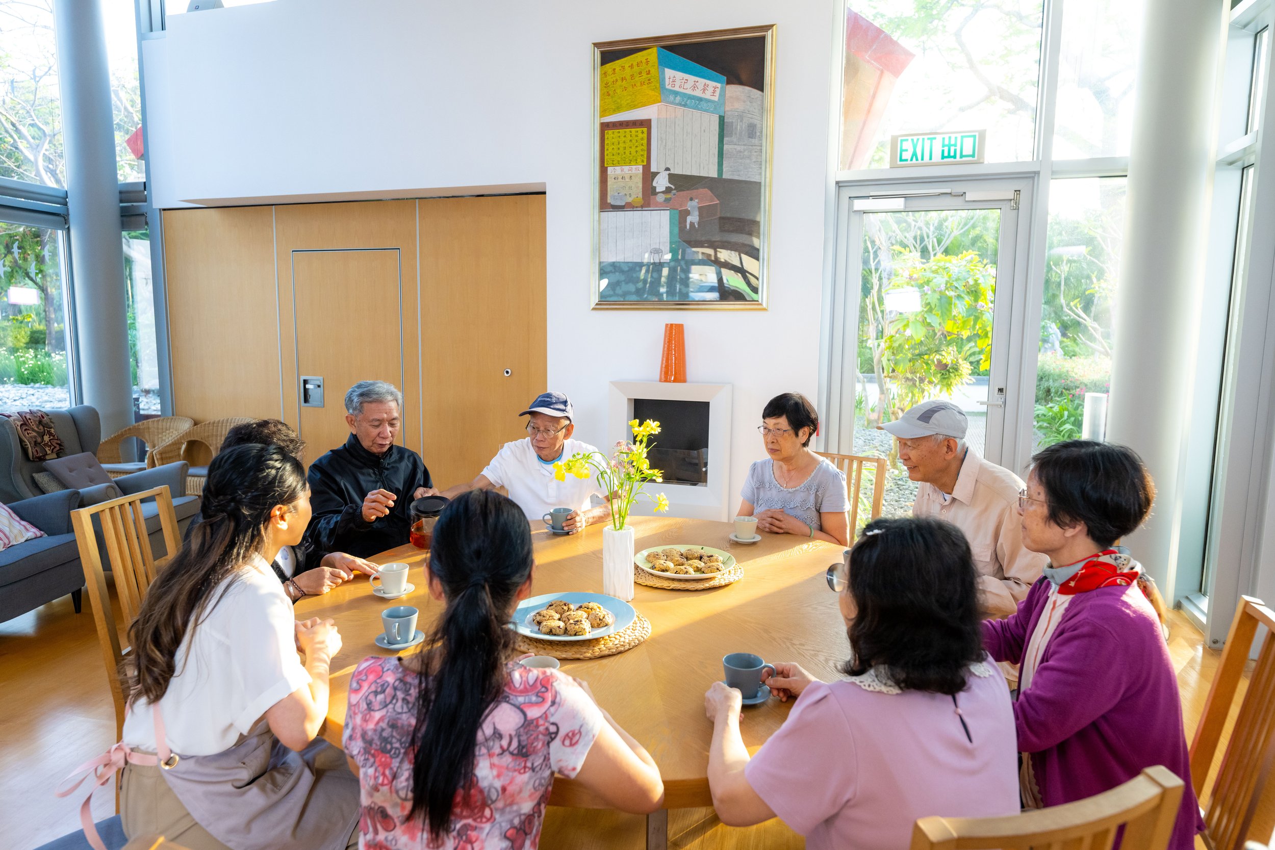
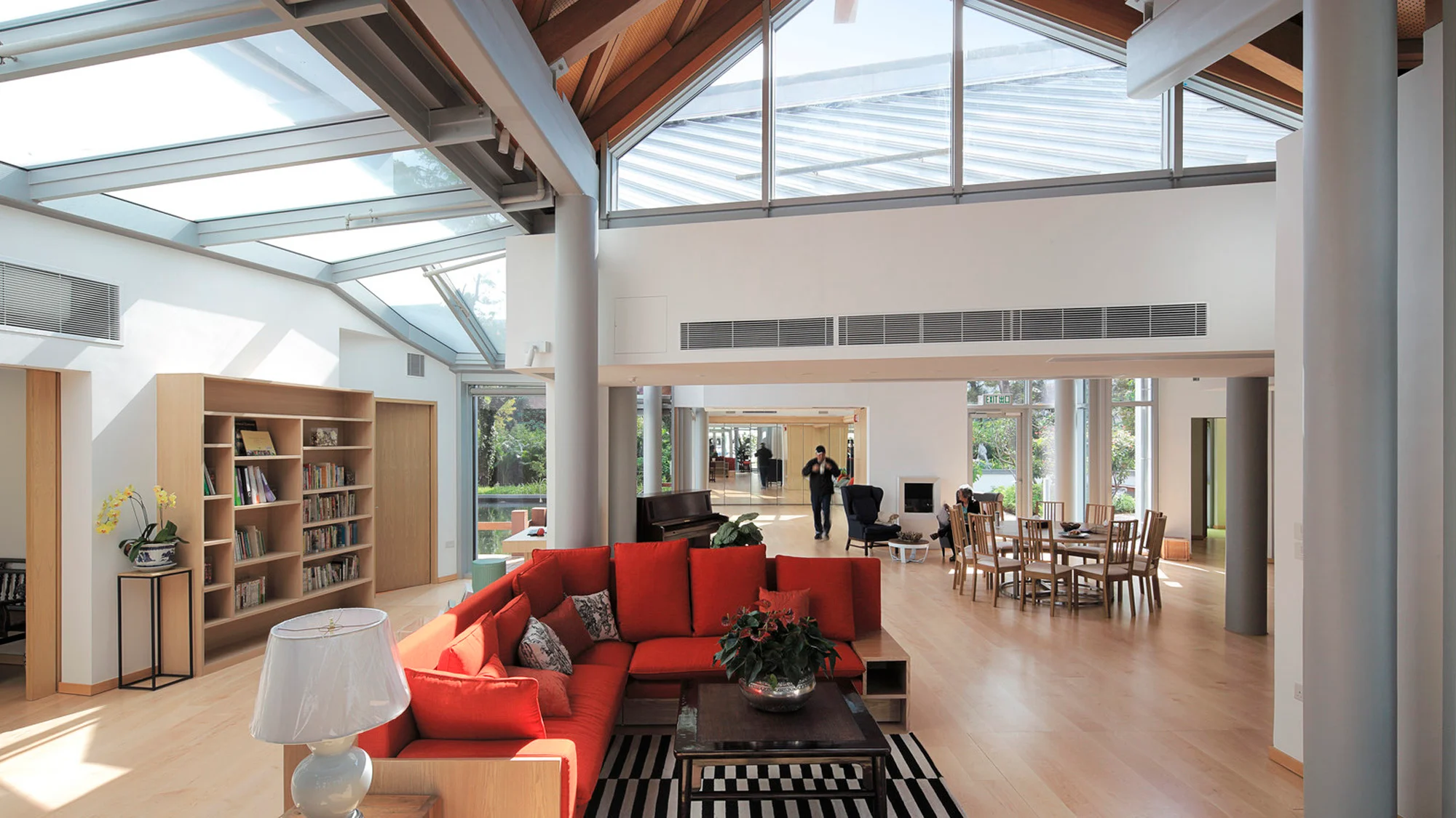
坐落屯門的銘琪癌症關顧中心出自建築師法蘭克.蓋瑞事務(Frank Gehry)之手。由 2013年落成至今,中心一直為癌症患者、家屬及照顧者提供免費支援服務。中心雖然鄰近屯門醫院,但外觀上卻像是一座園林別莊。以中式庭園為設計概念,中心内有一個花園和池塘,以及一條環繞主建築的木製步道。主建築則由六座相連的小屋組成,以落地玻璃和天窗,將景色帶進室内。主建築以公用廚房和客飯廳為主要區域,鼓勵病友多分享和交流。而屋内亦鮮有間隔,更沒有診所常見的登記處和指示牌,務求營造出家居感,讓病友可以在此梳理情緒,療癒身心。
無論是現有的醫療、社福設施,又或是關顧中心等體制外的空間,以上案例都闡述了以設計促進健康的可能性。透過運用自然元素、具同理心而又貼近日常的設計,設計師們成功地將「健康」空間變得更生活化。隨著社會大衆日漸重視「健康」,不知道又能否擴而充之,將這些空間營造手法應用於其他城市空間,進一步推廣全人健康呢?
Designing for health: Creating "healthy" spaces that tie in nature and connect with life
In the previous article, GUTS explored how the concept of "health" has evolved in relation to spatial design, examining the development of medical and social welfare facilities in Hong Kong. We shed light on the influence of the definition of "health" on urban planning, design, and spatial organisation. As the idea of "holistic health" gains popularity, designers are increasingly striving to create spatial experiences that are centred around human needs and environmental factors, with the aim to enhance both physical and mental health and well-being. Let us now examine various case studies to gain insight into how the concept of "health" is applied in spatial design in this issue of GUTS.
Dementia village in the Netherlands: Embracing normalcy while living with dementia
Situated in Hogeweyk, a town in the Netherlands, The Hogeweyk stands as the world's first "dementia village," exclusively catering to elderly individuals with severe dementia. The objective of The Hogeweyk is to provide a living environment where people with severe dementia can live as usual. By implementing changes in spatial design and operational models, it endeavours to create a reassuring and comfortable setting that preserves the autonomy and quality of life of its elderly residents.
The choice of naming it a "village" goes beyond breaking away from the typical image of a nursing home: identical "patient uniforms," restrictive clothing that limits movement, crowded and cold rooms. It also reflects its small-town-like scale. The Hogeweyk primarily consists of 23 double-story individual houses, operated by nursing staff, as well as shops, restaurants, and public spaces like squares. The "residents" can freely "go out" and interact with other "neighbours" as they move around different spaces. Behind these seemingly ordinary scenes lie considerable thoughtfulness. For instance, the town's facilities are interconnected by a single main street, without back alleys or dead ends, such spatial layout significantly reduces the risk of the elderly getting lost. Additionally, since dementia patients often struggle to adapt to change, the team deliberately constructed the entire village in architectural styles reminiscent of the 1950s to 1970s, hoping that the familiar environment would assist them in adjusting to their new surroundings.
The effectiveness of the "dementia village" model in slowing down cognitive decline still requires further research to validate its benefits. However, taking The Hogeweyk as an example, after the conversion of the traditional nursing home into a "dementia village" in 2009, the number of elderly residents who depend on psychotropic medications to improve their mood and behavioral issues has decreased significantly. This indicates that the model has demonstrated some effectiveness and highlights the essential role of environmental factors in enhancing the quality of life and health of dementia patients.
Helsingør in Denmark: Integrating nature into a asterisk-shaped mental hospital
Situated in Helsingør, a coastal city in eastern Denmark, this psychiatric hospital takes the form of a two-story, asterisk-shaped geometries. It was collaboratively constructed in 2006 by two renowned architectural firms, Bjarke Ingels Group (BIG) and JDS Architecture. The hospital's distinctive appearance stemmed from extensive user research conducted by the project team. Their objective was to deeply understand the habits and needs of medical staff, inpatients, outpatients, and patients' families, in order to derive their expectations for the new hospital and base the spatial programming on them. Despite being unable to ascertain the "ideal appearance" of the new hospital through the user research, the team successfully identified four sets of spatial characteristics that are conflicting in nature, yet can impact user experience:
A space that offers both openness and inconspicuousness
A layout with short walking distances while maintaining a sense of spaciousness
Balancing patient autonomy, freedom, and healthcare staff control
Respecting patient’s privacy while fulfilling their social needs
The team recognised that skillful balance and a departure from traditional hospital designs were necessary to meet the users' needs. Consequently, they identified several types of spaces required for the new hospital, including:
Common areas for patient use
Private rooms for inpatients
Consultation rooms, offices, and other facilities
Green spaces
Subsequently, utilising these four types of spaces as a foundation, the team discovered a spatial arrangement that could effectively balance the mentioned characteristics while optimising the surrounding natural environment. After multiple rounds of testing, they decided on an asterisk-shaped layout, with the hospital's central hub extending outward. Along the four corridors facing the mountains and the lake, individual rooms were distributed on both sides, separated by common spaces and green areas in the middle. To enhance the healing effect, the team intentionally utilised natural materials like wood and constructed the hospital's first floor underground. Floor-to-ceiling glass and skylights were incorporated to seamlessly integrate the hospital with the surrounding hills, allowing patients from different areas of the hospital to have closer proximity to nature.
Tuen Mun: A home-like cancer care centre
Located in Tuen Mun, the Maggie's Cancer Caring Centre is the work of architect Frank Gehry. Since its completion in 2013, the centre has been providing free support services to cancer patients, their families, and caregivers. Despite its proximity to Tuen Mun Hospital, the centre's exterior resembles a garden villa. Designed with a Chinese-style courtyard garden concept, the centre features a garden and pond, as well as a wooden pathway surrounding the main building. The main building consists of six interconnected cottages, with floor-to-ceiling glass and skylights that bring the scenery indoors. The central area of the main building includes a shared kitchen and dining room, encouraging patients to share and interact. The interior of the cottages is mostly open without partitions and lacks the typical registration counters and signboards found in clinics, aiming to create a homely atmosphere where patients can sort out their emotions and heal their minds and bodies.
Whether it involves existing medical and social welfare facilities or non-institutional spaces such as care centres, the above examples illustrate and demonstrate the potential of design in promoting health. By incorporating natural elements and designing with empathy that resonates with everyday life, designers have successfully made "healthy" spaces more livable. As society increasingly emphasises "health," it remains to be seen whether these space design techniques can be expanded and applied to other urban areas to further advance holistic health.
你可能對以下吉人吉事有興趣:
You may also be interested in these GUTS Stories:


