Tsim Sha Tsui Bookstore | Hong Kong
-
Category: Public Space & Architecture, Interior & Product
Type: Interior | Bookstore
Location: Tsim Sha Tsui, Hong KongClient: SUP Retail (Hong Kong) Limited
Completion: 2021
Area: 1,600 sqm
Tsim Sha Tsui Bookstore
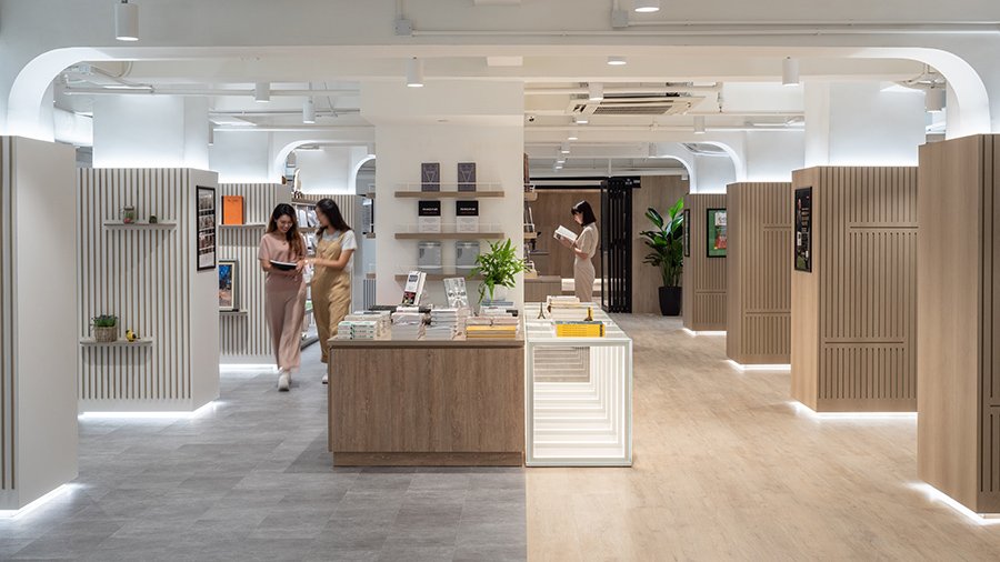
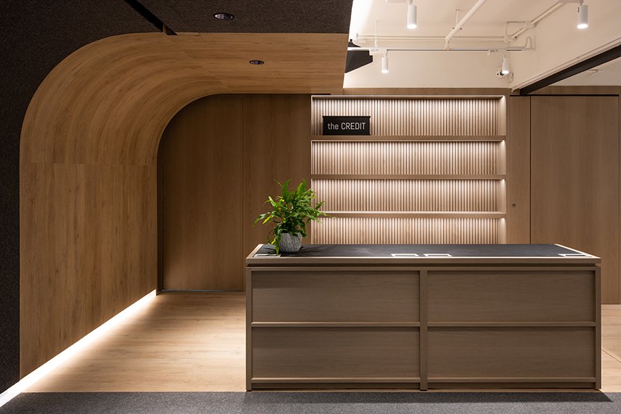
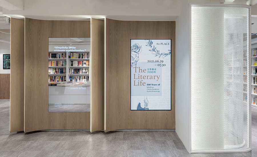

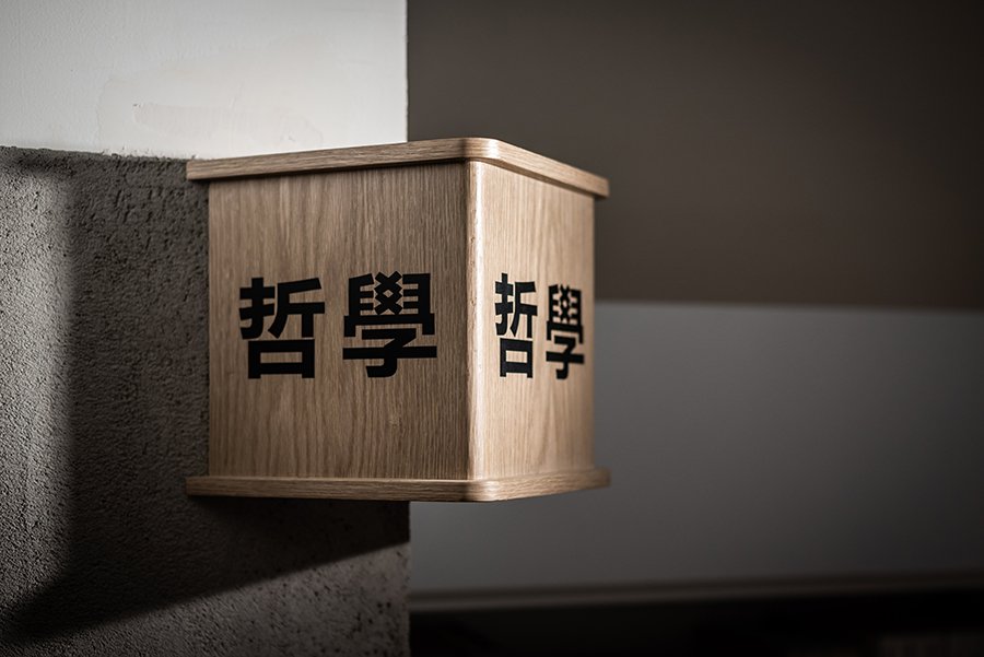
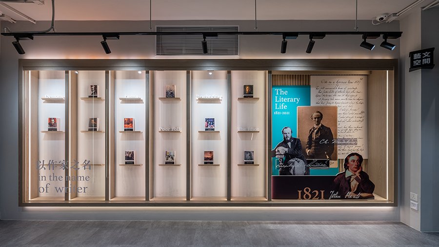
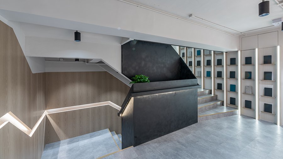
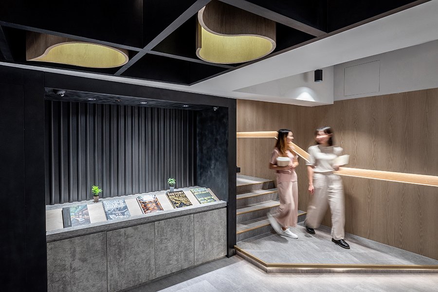
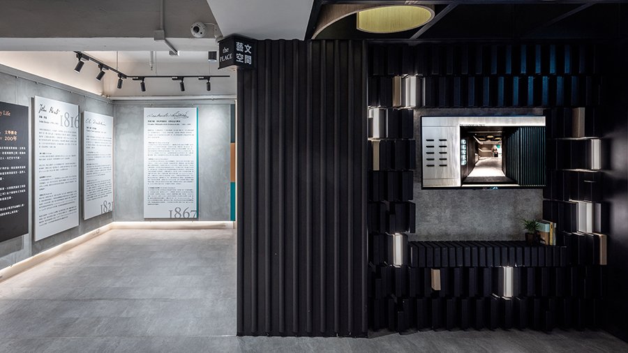
In this 1,600sqm bookstore, onebite has translated the chapters of a book into a distinct spatial experience that seeks to excite and entice readers. By having simple yet articulated splits in space through textured materials, furniture proportions and lighting design, the sequence of a reader’s journey recalls the moment from one flips open the book. Starting from the “foreword”, a monotone exhibition zone on the ground and mezzanine floors, the design of this transitional space wishes to evoke the sensations of offloading our mental baggage and clearing our headspace as we step away from the busy street in Tsim Sha Tsui (TST) district.
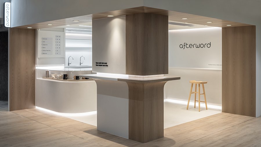
One immerses into the contents of the book when he enters the “arrival hall” on the first floor. As he makes his way into different zones, the sharp colour contrasts and material splits represent changes in book category or bookstore function. The reading journey completes inside the calm and relaxing afterword cafe, serving as a fulfilling and anticipatory prologue for the book.
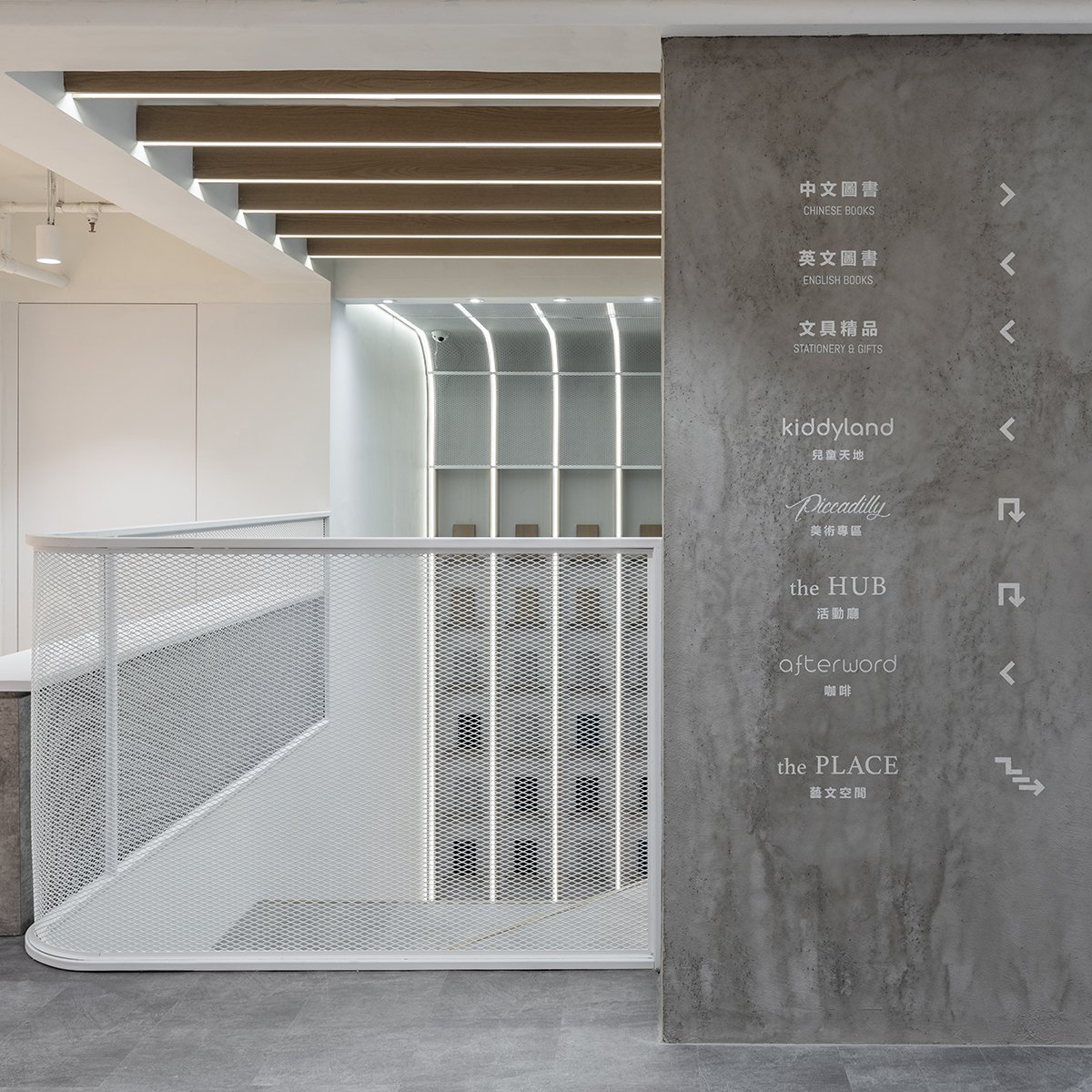
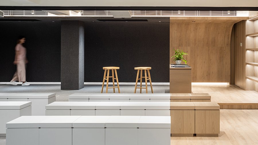
In the main space on the second floor, the bookstore consists of several zones for Chinese books, English books, art supplies, lifestyle products, and kids activity zone. An important feature rarely seen in Hong Kong bookstores burdened by a lack of space and sky-high rents, is the presence of a multi-purpose room. This allows a variety of activities to convene here, with live broadcasting facilities catering for a hybrid mode of physical interaction with readers, and virtual dialogues with those participating from home or overseas.
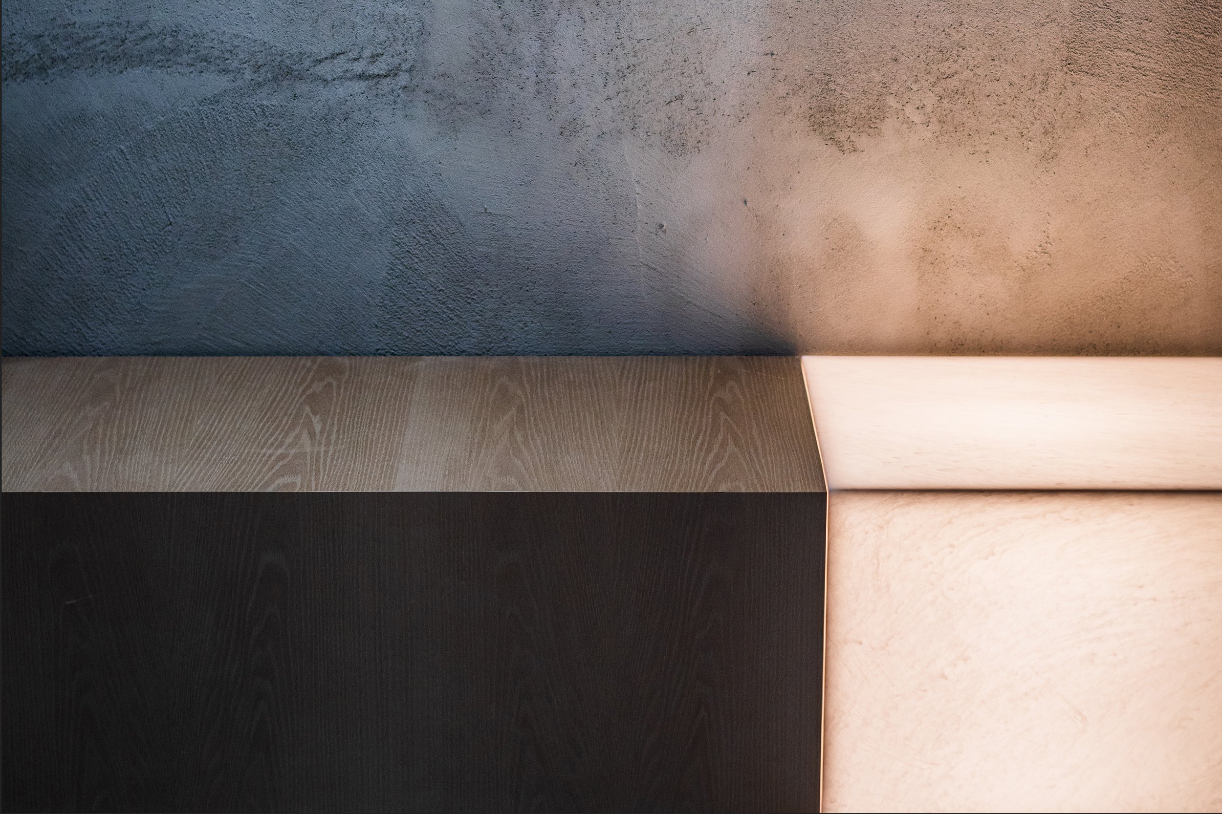
The interplay of materials forms the main circulation for readers through the space with stark contrast walls and cabinetry creating an eye-catching and aesthetically pleasing space.
Colours are stripped down to basics so that the space created becomes the ideal backdrop for books and to showcase the vibrant cultural content. Materials in the interior space are treated with considerations for its tectonic qualities, such that every edge, surface and volumetric space can be articulated clearly.
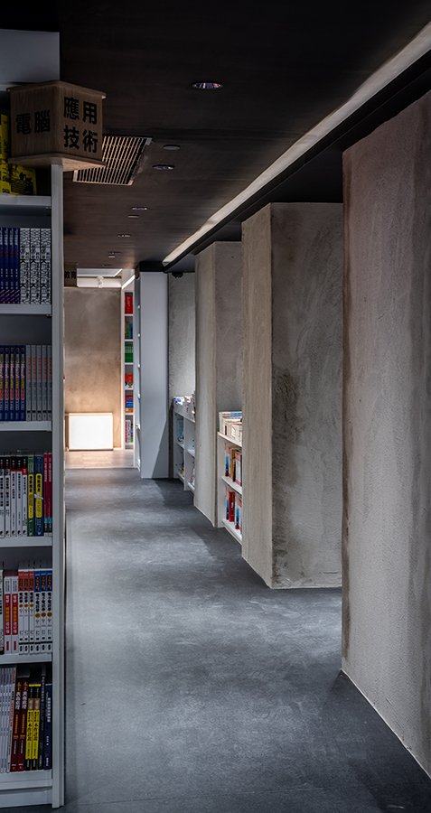
On the ground floor, the book journey starts along a stark monotonous wall inspired by blurred movement from flipping the book. A dimly lit entrance with dark tone material is designed to slow down the readers’ pace as he proceeds from the brightly-lit street entrance into the house of literature. The ground floor contains a spacious feature display area, representing the treasured contents inside a book.
Climbing up the staircase, the steel parapet coils through the staircase core and leads readers into another exhibition space at the mezzanine floor, then subsequently into the main space of the bookstore, the lobby of books on the first floor. The prominent double-height book wall at the entrance evokes the sensation of entering the concourse of a station; a promising and exciting start of an adventure.
The sharp visual split in colour and material down the centre of the lobby of books, divides the central circulation space of the bookstore into two halves - one leading to novels, and the other leading to the lifestyle area. The numerous and bulky columns found in the space, once considered a hindrance to spatial design, had been cleverly integrated into the retail space as a series of colonnades, creating a unique visual corridor that focused readers’ attention towards the perceived depth of the bookstore. The book walls here are not merely furniture, they are meant to generate visual connections and inspire moments of conversations through material articulation and anthropomorphic features to bring convenience to users. The far end of the vista terminates at the multipurpose room which serves not as an ending point, but the figurative start of another journey with live broadcasting function allowing physical and virtual activation that allows people to gather and mingle.
The afterword cafe is located at the other end of the interior space. It provides the optimal conditions to unwind and reflect after an intense dialogue with books. Decked in a mix of contrasting white and oak-coloured timber panelling, the cafe corner creates a relaxing atmosphere, with touches of lightly-stained wood surfaces reminiscent of the ochre colour of papers used in novels.
Books are core to passing on scientific knowledge and social norms. Reading transmits and disseminates ideas among people. We hope this bookstore in TST can embody and enhance these values, with the curated spatial experience allowing one to enjoy the bookstore as a culture haven, not just another soulless retail shop.
Walk a Book . Flip a Space
-
This project builds upon onebite’s extensive background in interior design and prior experience in fitting out bookstores. As such, materials used adheres to strict standards on health and safety standards, and sustainable material standards suitable for indoor usage.
More crucially, the design of the store seeks to create a more intimate and personalised cultural experience for readers who are less and less unlikely to acquire knowledge from books. Hence, the sensations of holding and reading a book is embodied within the design as a therapeutic and self-reflecting process that calms the mind and soothes the eyes from a relentless onslaught of computer screens and incessant media content feed.
Design for Good ValuesReinvent Space
ESG/ Sustainability Factors
Customers
- Arts Media & Culture
- Health & Wellness
-
Excellent, Retail, HKDA Global Design Awards 2021
Silver Award, Best Retail Design | ≥ 5001 sqf, Design Excellence Award 2021
-
Photographer: Tai Ngai Lung
One Biters: Alan Cheung, Arnold Ng, April Kwok, Eleanor Fu, Lung Mak, Sherman Sun, Kary Chan, Lucinda Ku
-
#bookshop #bookcafe #monotone #zones
Related Projects


