Mong Kok Bookstore | Hong Kong
-
Category: Public Space & Architecture, Interior & Product
Type: Interior | Bookstore
Location: Mong Kok, Hong KongClient: SUP Retail (Hong Kong) Limited
Completion: 2022
Area: 400 sqm
Mong Kok Bookstore
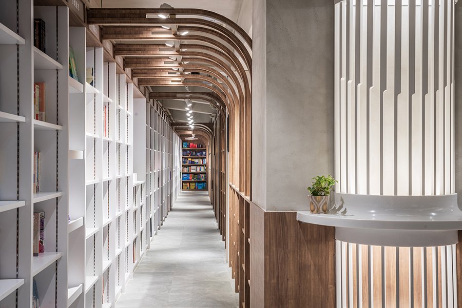
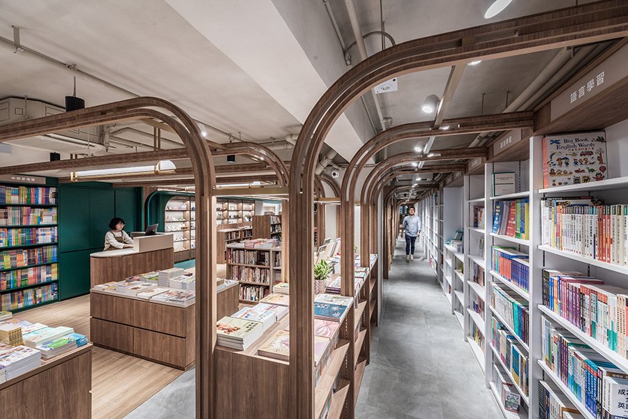
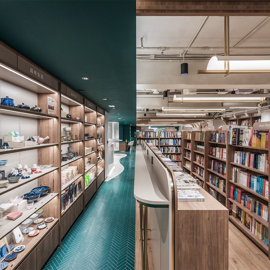
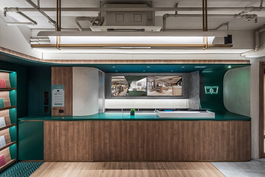
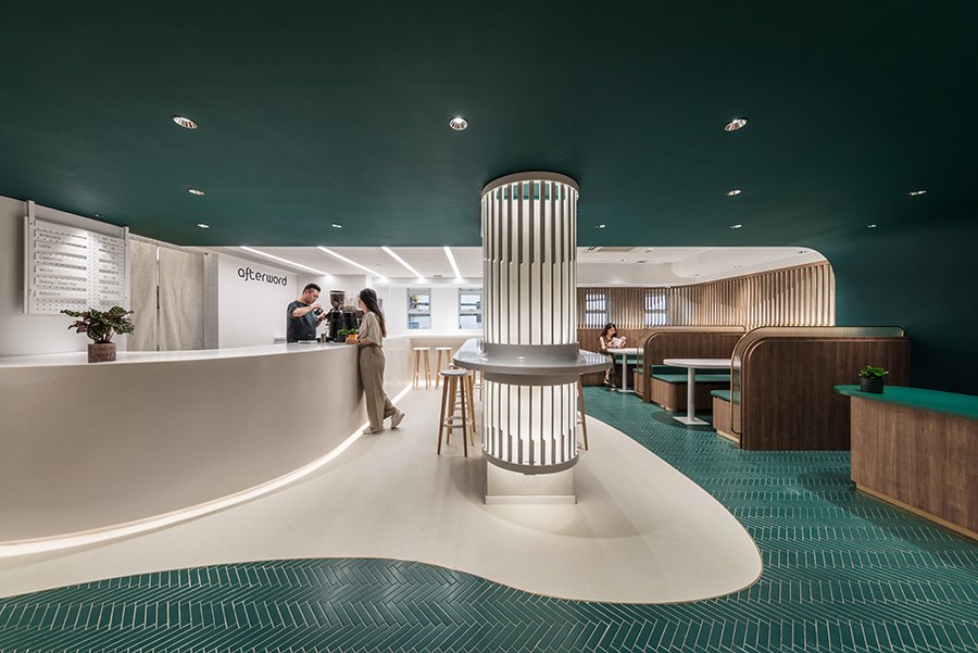
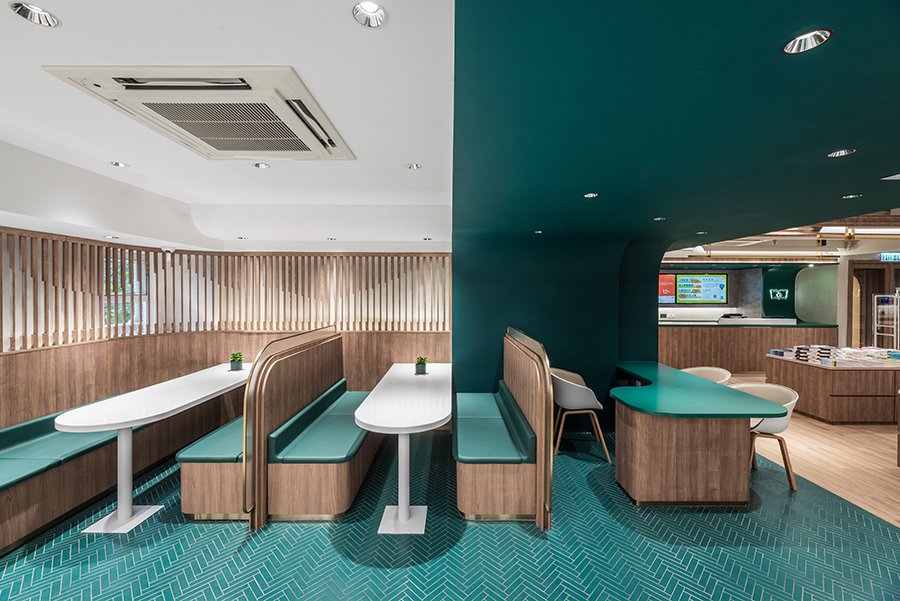
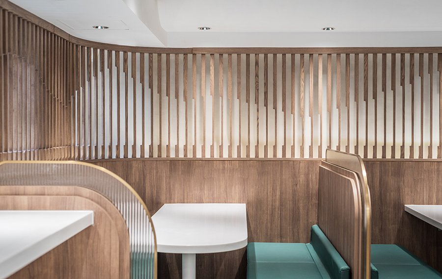
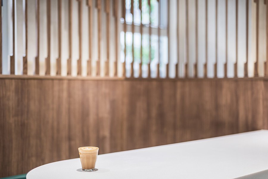
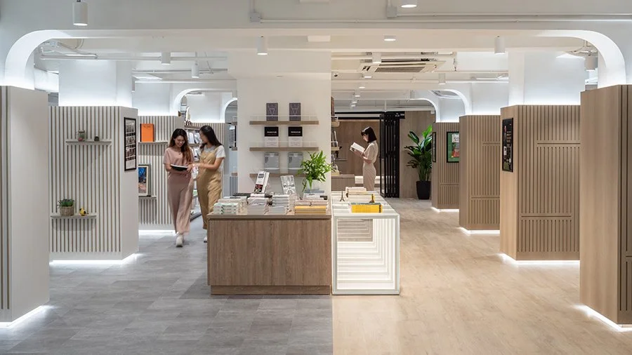
Visiting a bookstore offers respite from the hustle and bustle of urban life. Finding the chance to take such a momentary pause becomes even more precious in Mongkok, the retail and commercial heart of Hong Kong where one is more likely to find high street fashion outlets and trendy eateries rather than stumbling upon a treasure trove of knowledge and ideas.
Commissioned by SUP Retail (Hong Kong) Limited, onebite’s interior design and branding exercise for Commercial Press (CP)’s new outlet on Shanghai Street seeks to accentuate the concept of a treasure trove through an exploration of different surface treatments, lighting effects, and the creation of spatial surprises.
CP’s outlet is located on the first floor of a five-storey commercial building housing a variety of education-related functions, including bookshops, a teachers’ training centre, as well as learning and enrichment facilities for students. As such, the design has to cater for the needs of three main user groups, namely students, parents, and teachers. The bookstore’s welcoming atmosphere invites them to seek intellectual nourishment, take time off to enjoy a beverage in between appointments, or simply take advantage of such an oasis to socialise with friends and colleagues.
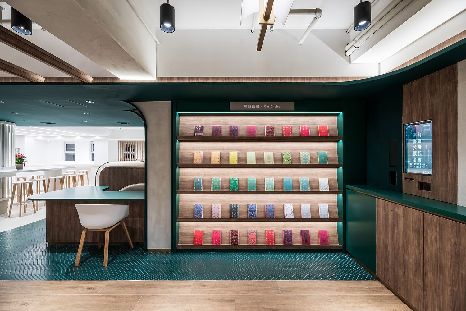
The tripartite arrangement is envisioned through the store’s spatial layout as three distinct zones. Named “Hunting”, “Treasure”, and “Reward”, they represent a sequential narrative that encourages visitors to discover knowledge, skills, and other forms of precious intelligence from the bookstore. These three zones are differentiated by its own signature colour on floor and wall colours, such as a grey concretious tone for “Hunting”; a warm walnut finish for “Treasure”; and a rich green hue for “Reward”, which evokes the image of emerald gems and the characteristic colour of CP’s logo.
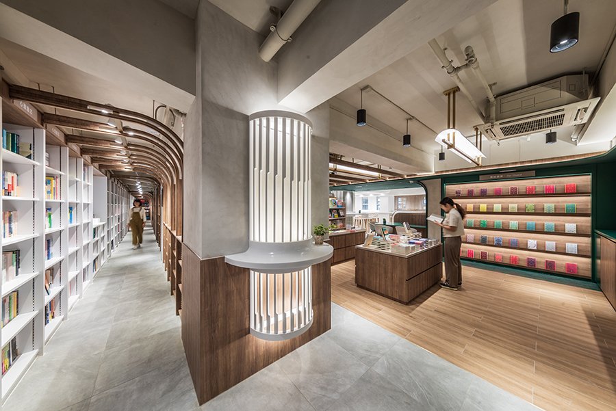
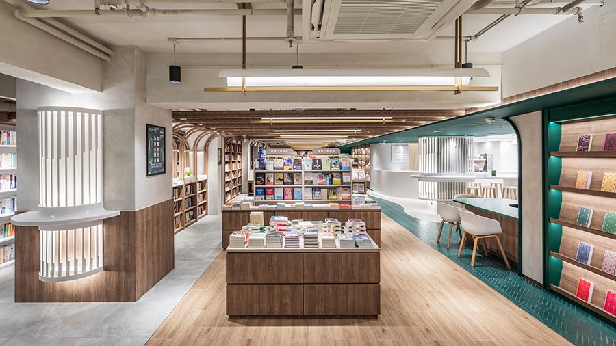
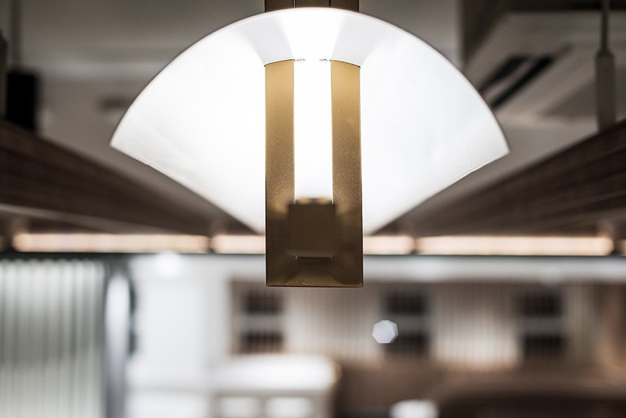
The concept of mining for and uncovering treasures is further accentuated through warm spotlighting effects and contrasting surface finishing. The overall lighting level of the store has been dimmed to recreate the atmosphere of an underground mine, while ceiling downlights and brass shelf lamps highlight decorative features and products on display to emphasise desirability and beauty. The store’s key spatial feature is a timber arched colonnade which runs across the length of the store. It not only focuses visitors’ attention on the tunnel-like linear arrangement of the space but also beckons them to enter and explore the treasure trove of knowledge further.
Similar to onebite’s bookstore design at Tsim Sha Tsui, also a CP outlet, the interior design of the Mongkok bookstore has to fulfil and integrate different functional requirements of a modern bookstore, such as displaying books, curating lifestyle objects, and designing a comfortable sitting area and robust kitchen environment for Afterword, CP’s inhouse cafe.
From primitive to refined experience
-
This project builds upon onebite’s extensive background in interior design and prior experience in the fitting-out of bookstores. As such, materials used adheres to strict standards on health and safety standards, and sustainable material standards suitable for indoor usage. Given that children are one of the bookstore’s main user groups, special care is taken during the design and fabrication process to ensure the quality of bookshelves and displays offered a high degree of accessibility and safety.
Design for Good Values
Reinvent Space
ESG/ Sustainability Factors
Customers
- Arts Media & Culture
-
-
Photographer: Tai Ngai Lung
One Biters: Alan Cheung, April Kwok, Sarah Mui, Venus Lee
-
#bookshop #bookcafe #curve #zones
Related Projects


